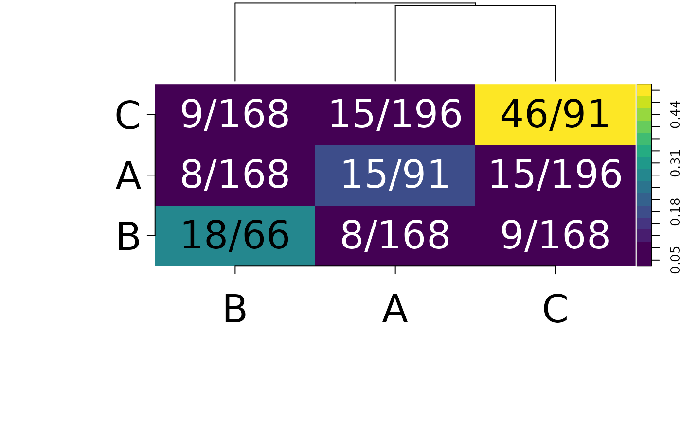
Takes the Ringbauer matrix and plots it. This was based on the Ringbauer paper and also the heatmap.2 function from gplots
Examples
get_ringbauer_measures(example_network, "site") |>
convert_ringbauer_measures() |>
plot_ringbauer(label_margin = 10, label_size = 3)
#> $density
#> A C B
#> A 0.16483516 0.07653061 0.04761905
#> C 0.07653061 0.50549451 0.05357143
#> B 0.04761905 0.05357143 0.27272727
#>
#> $labels
#> A C B
#> A "15/91" "15/196" "8/168"
#> C "15/196" "46/91" "9/168"
#> B "8/168" "9/168" "18/66"
#>
#> $text_colour
#> A C B
#> A "white" "white" "white"
#> C "white" "black" "white"
#> B "white" "white" "black"
#>